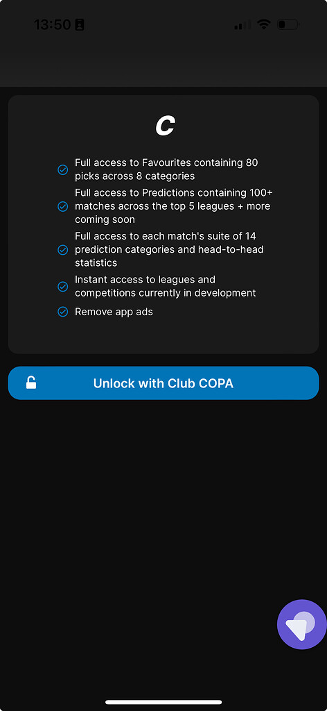
I’m struggling to work out how to make a single group the full width and height of a screen and make sure that the contents within the group are all responsive. For example, I have a group that is the login page of a one-page app in mobile view. How can I make sure the buttons are at the bottom and the login benefits are always spread and centred?
It will depends on how is your setup. If everything is inside a single group, change it alignment to “Align to parent”. The login component should be centered inside this group and the button should be aligned to the bottom.
If you could share some images of your group’s layout configuration we can assist you better…
Set a conditional for your mobile breakpoints. In this conditional, set the minimum widths of the child elements i.e the button to be 100%(or 90%, anything that suits you)
Hopefully the elements are not fixed width.
Also make the horizontal alignment to be center.
You can share photos of your layout properties…these are just the top of my head tips.
Set the width and height of the parent group to 100%, uncheck the set fix width of the child elements
Use align to parent layout, this will help you set the element in middle or bottom
Button inside a floater set to float relative to bottom
I don’t understand what login benefits are. I guess this is about login links/buttons going to the top and centered. Same approach. These clickable elements placed inside a floater set to float relative to top.
Hppe this contributes to the other great suggestions ![]()
Here are some screenshots of the current setup. No luck aligning the Join COPA group to parent.
Group “Join Club COPA”
→ Container Layout: Align to parent
→ Height 100%
Group “Fixture – Premium C…”
->Aligned to the Center

Group “Group – Club COPA”
->Aligned to the Bottom Center

Yes I’ve tried that and it only fill half the screen. Do the parents of Join Club COPA need certain settings as well? I think they may have fit height to content ticked, but when I uncheck them they just fill in the entire editor? Thanks for your help so far ![]()
